


|
OTI Allocation Graphs
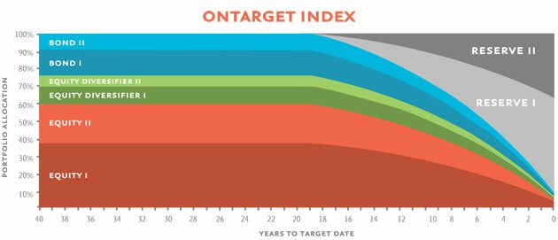
This chart provides a graphic representation of the glidepath and allocations of the OnTarget Index (OTI). Each distinct color band represents one sub-asset class. We utilize a two-asset class strategy; that is, a growth/risky asset represented by the colored bands, and a reserve/preservation asset, represented by the grey bands.
The primary glidepath is the curved line going from the left of the graph to the right of the graph over time, separating these two asset classes. Notice how the amount of growth asset declines, slowly at first, and then more rapidly as the target date approaches. By tracing the line, moving left to right over time, one can approximate the allocation of the growth versus the preservation asset at any point along the line. Note: The OnTarget Index represents the core of our index developmental work. We also maintain alternative models with varying amounts of growth assets at the target date. |